
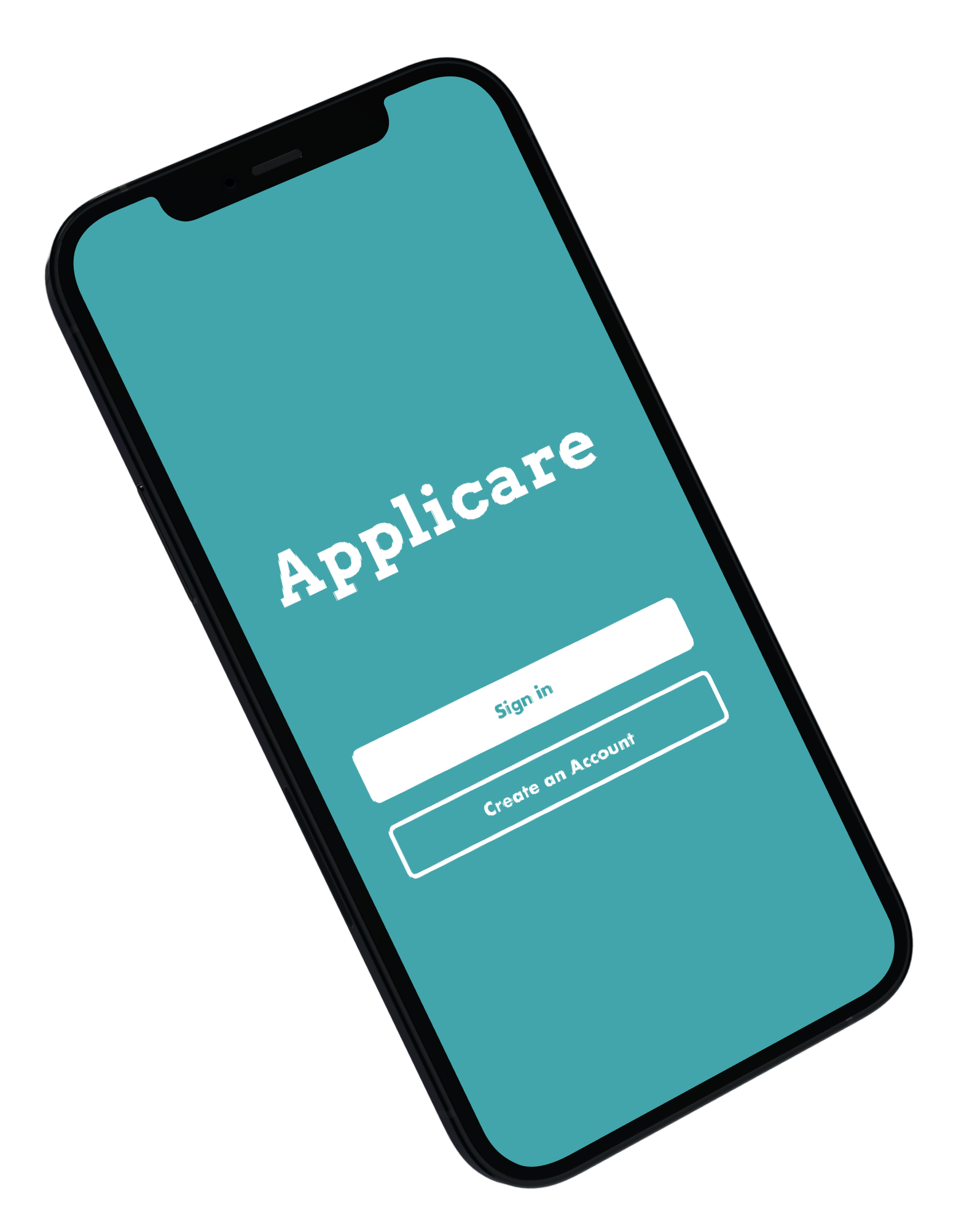
Applicare
A mobile app aims to improve students’ experience in finding internships

Currently, the internship search process is one of the most frustrating, isolating, and confusing aspects of many students' college careers.
We aim to address and improve the main issues for our users in the internship search and application process.
We are team DCI, composed of 3 undergraduate Human-Centered Design Students at the University of Washington. We are all both user researchers and designers in this project.
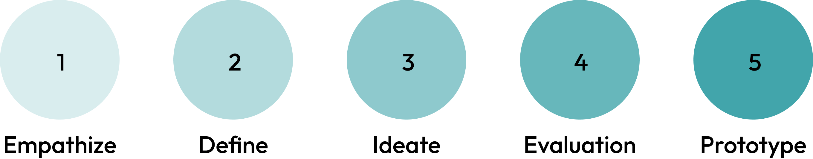
We developed a unique solution for our target users by following the Design Process: Empathize, Define , Ideate, Evaluation, and Prototype. This process allowed us to have a better understanding in our problem statement and the target audience first and move on to the design phase, ensuring the product matched the users’ needs and solved their pain points.
Each of us conducted one interview to understand users’ personal experience with the internship search process, their opinions on various popular internship application sites, and their frustrations regarding the process. This user research helped us pinpoint specific frustrations that users had during the internship searching and application process.


We collaboratively synthesized our interview findings primarily to identify common attitudes, pain points, and goals amongst our interviewees.
These pain points included:
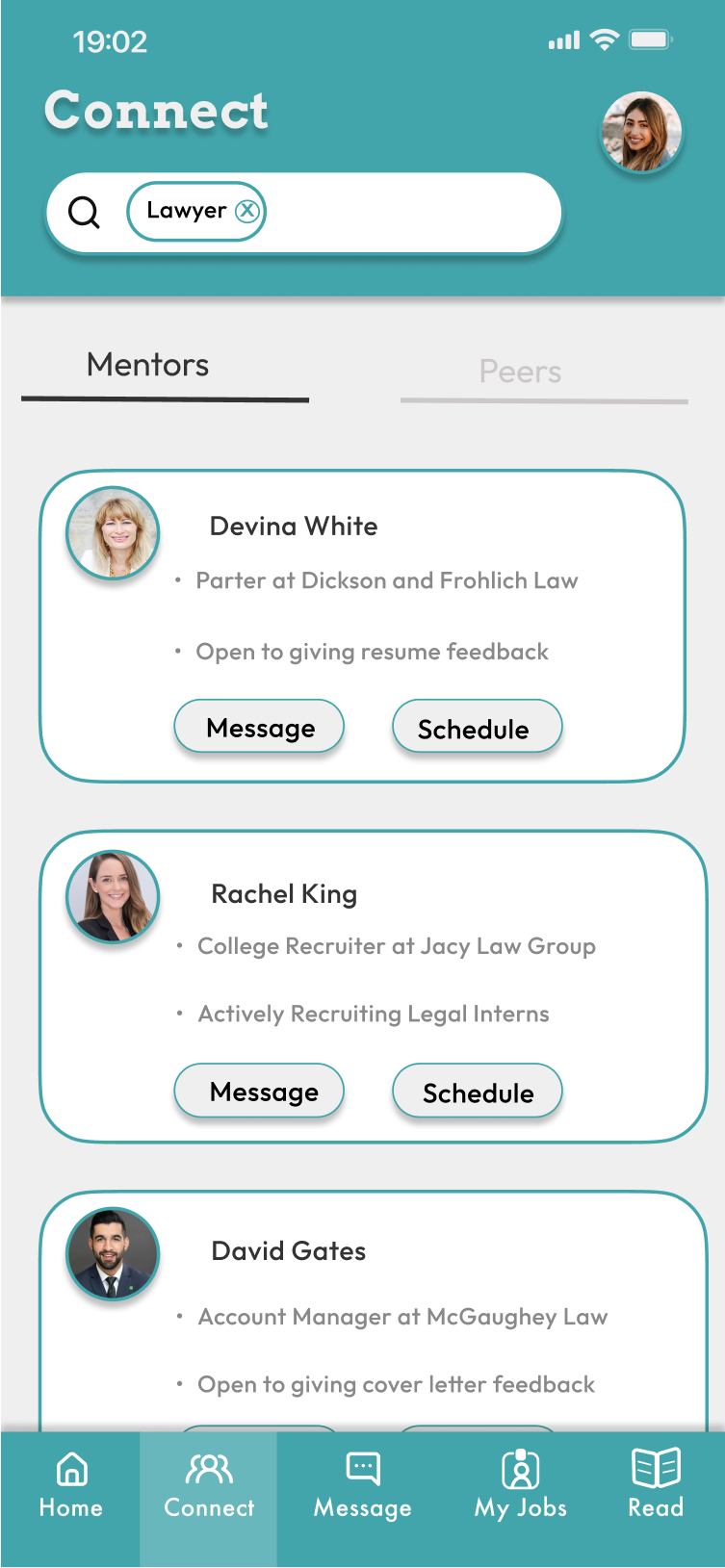
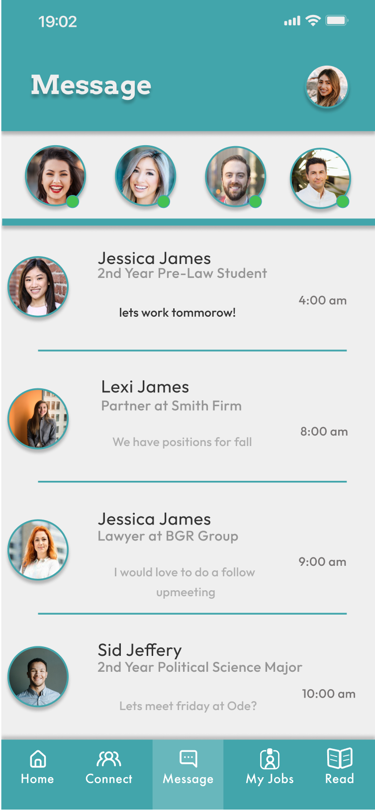
• Lack of guidance during the internship application process
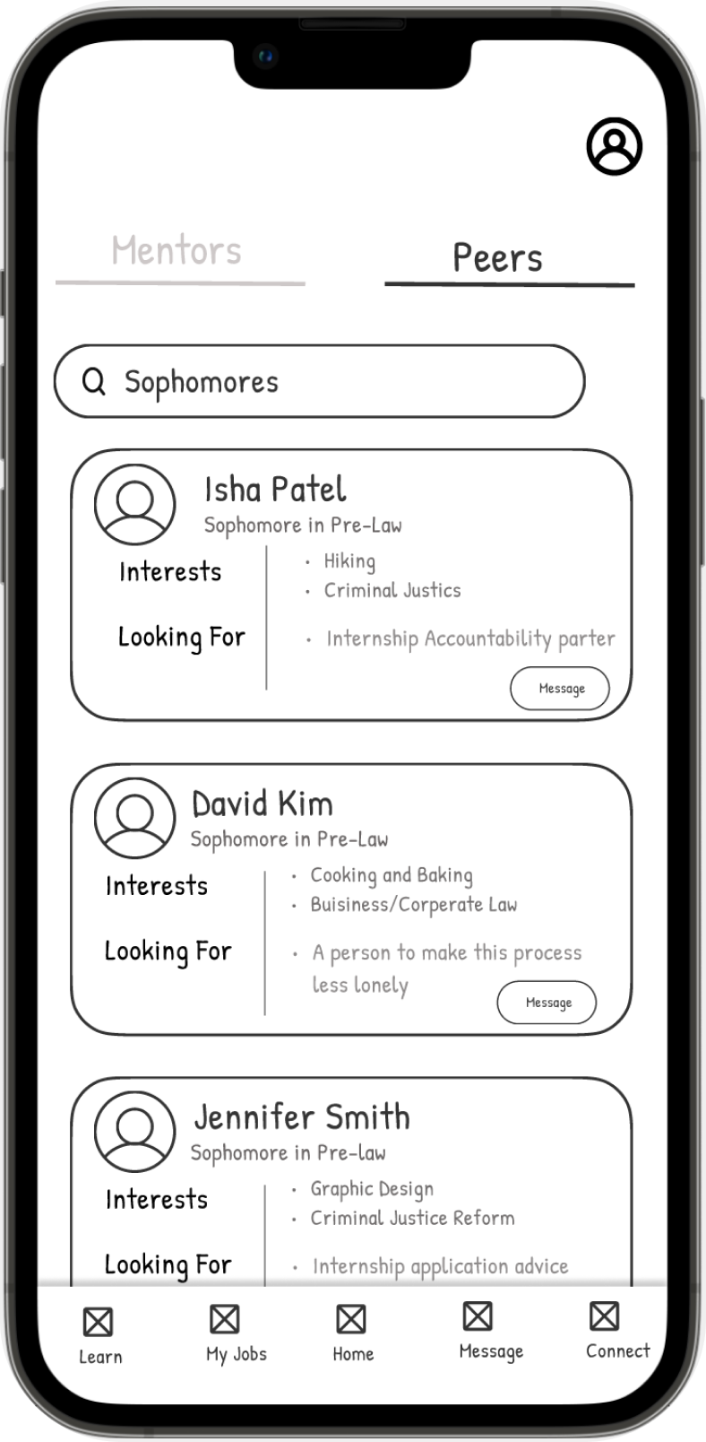
• Feelings of inadequacy and peer-induced stress
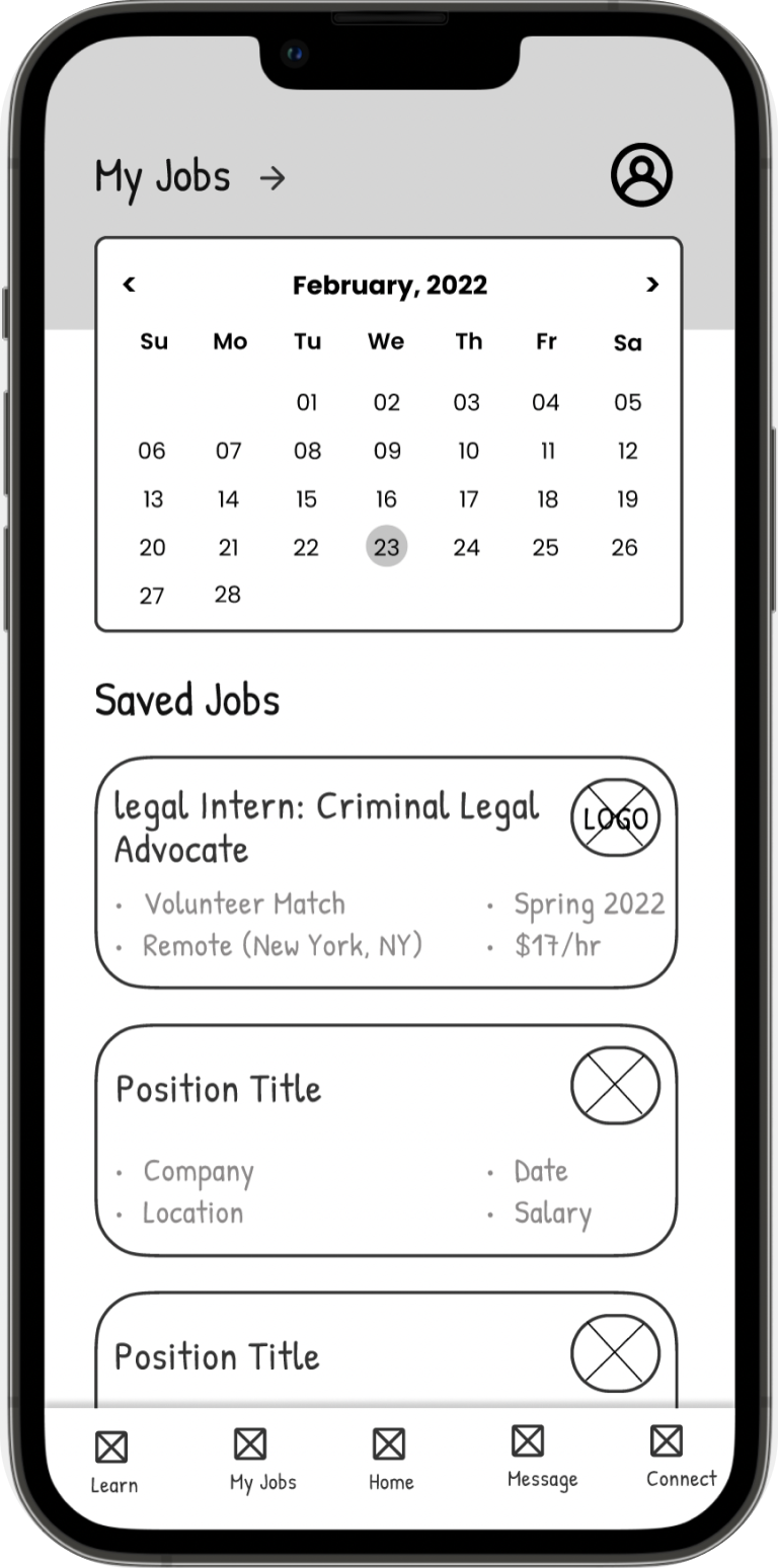
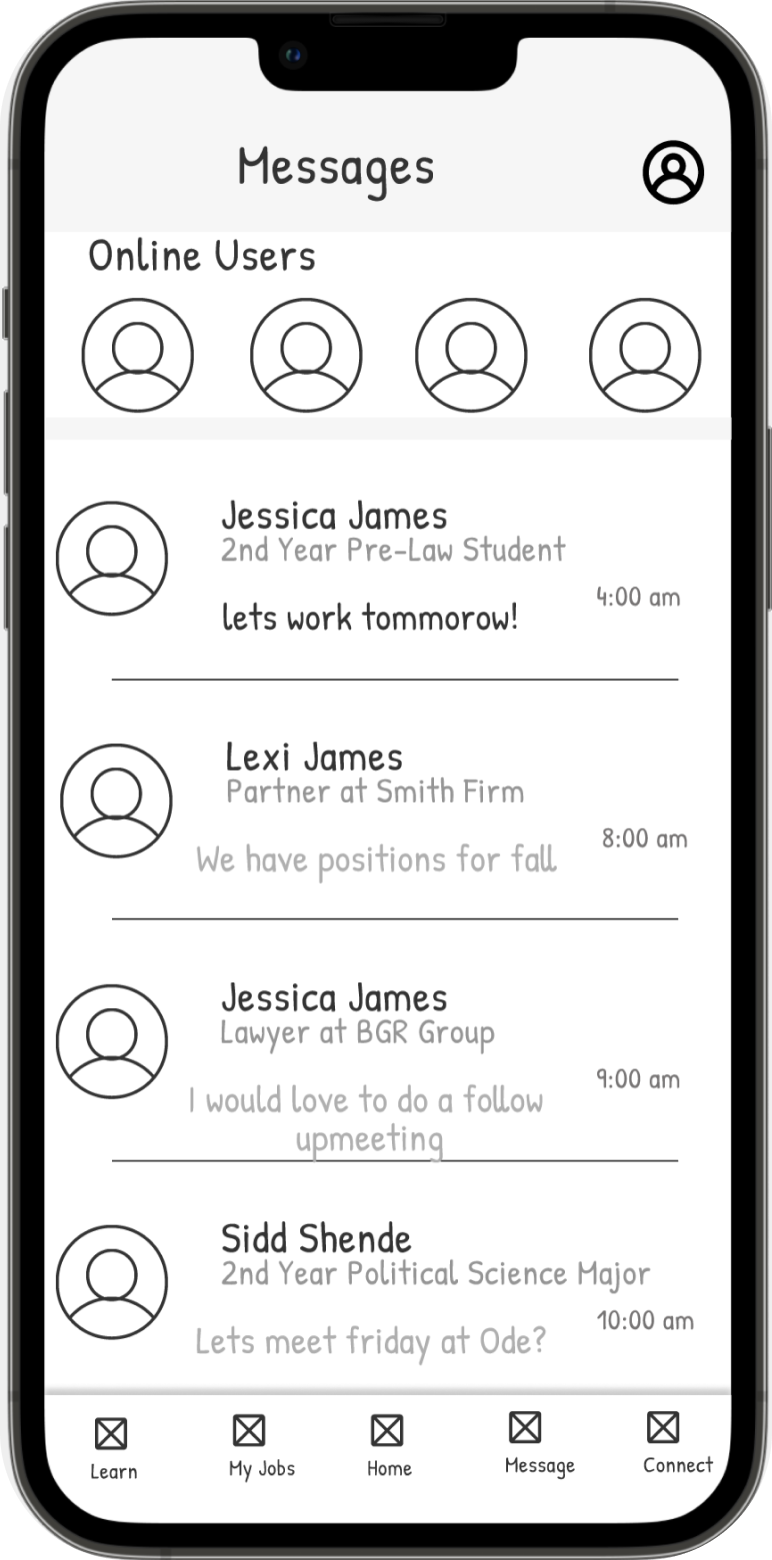
• Frustration with tracking internship application statuses
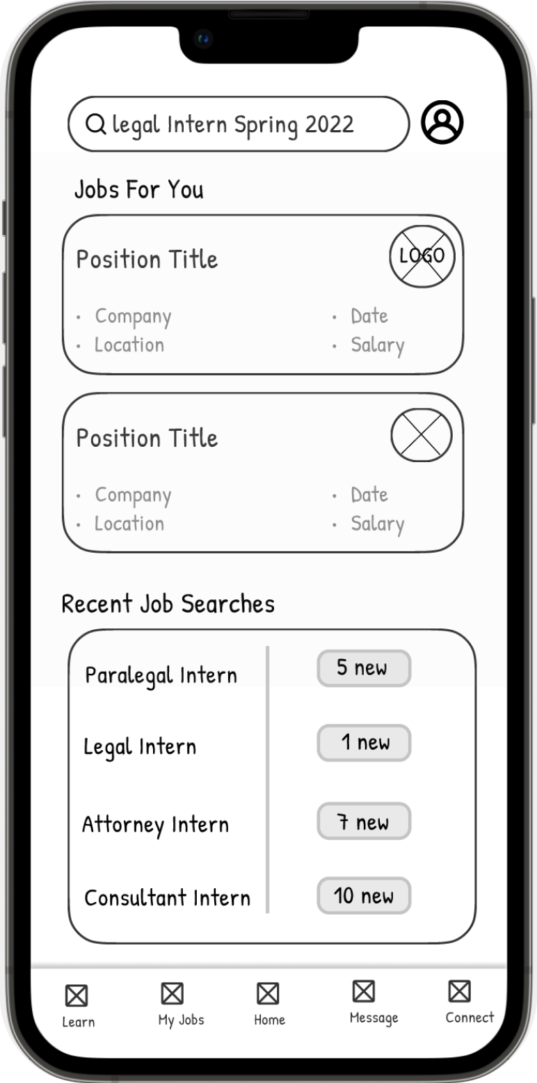
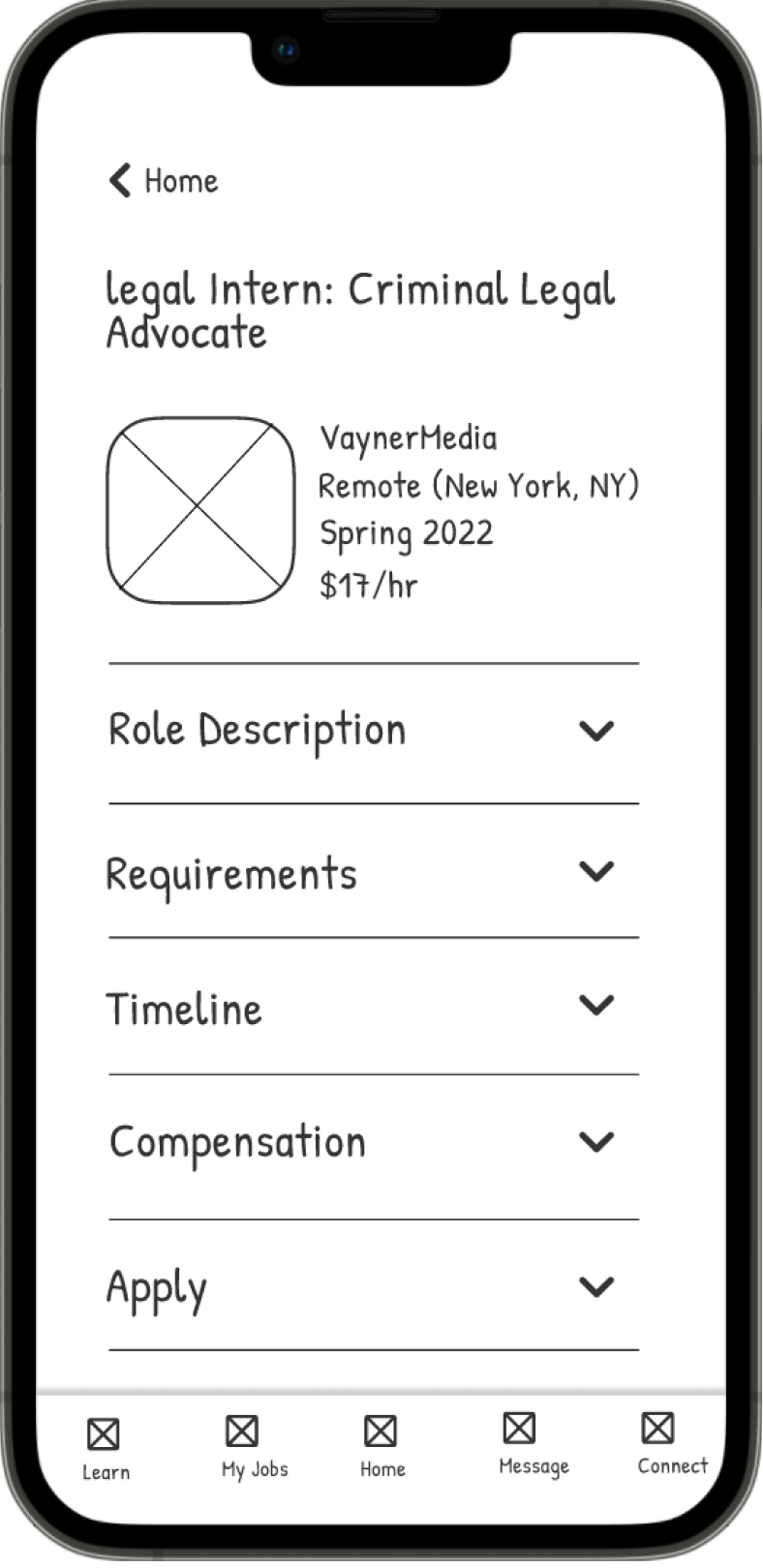
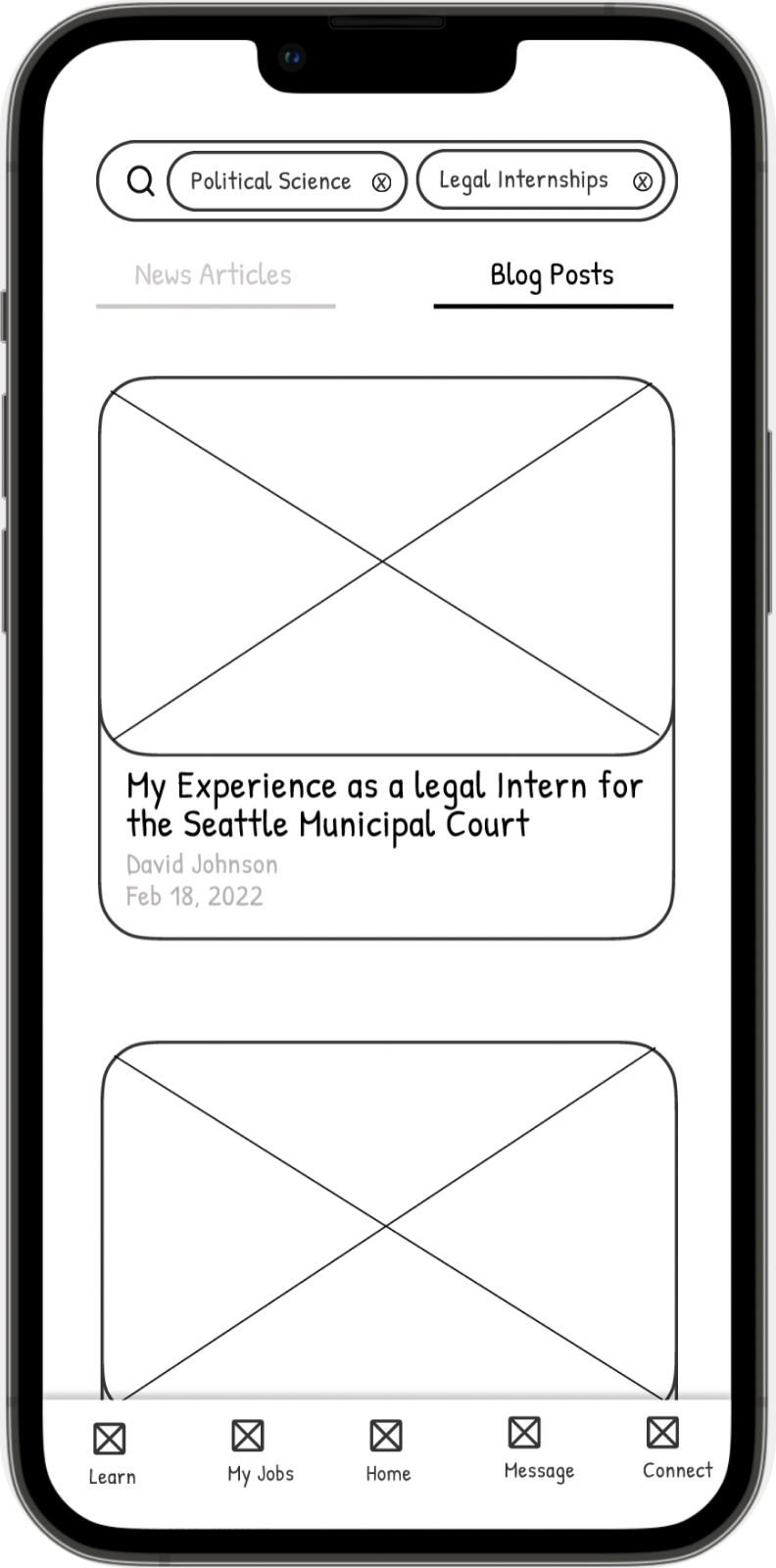
• Lack of clarity, specifically regarding salary and requirement information, in internship job descriptions
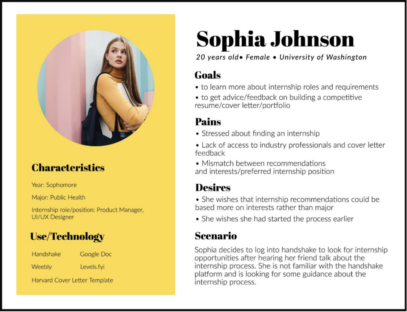
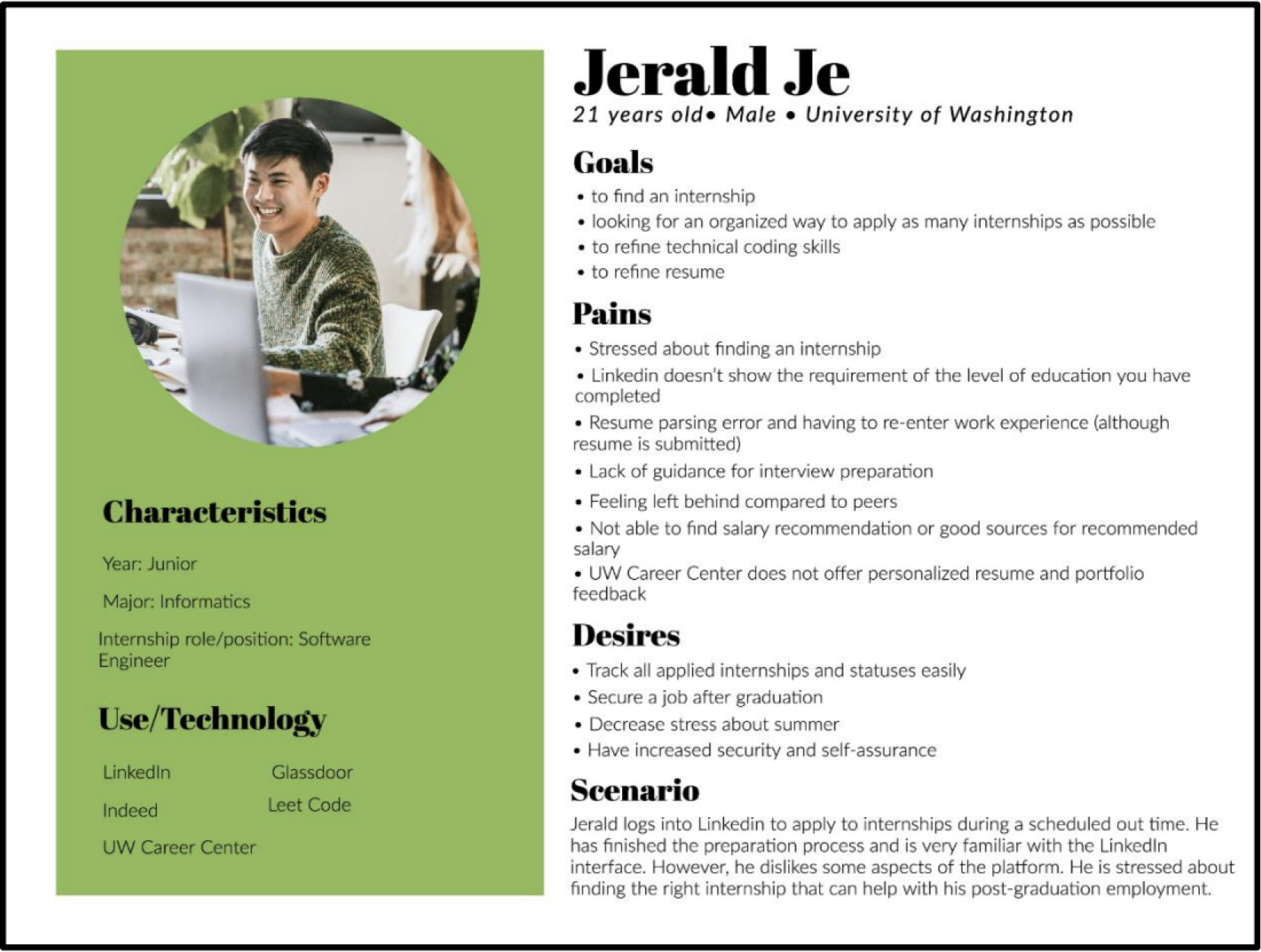
Next, we translated our research findings into user personas. Each persona, Sophia and Jerald, represents a different stage of the internship search and application process.
Sophia represents the archetype of an individual who is just starting to learn more about the internship process. Jerald is a more experienced individual, who is looking to get industry feedback on his application materials.
Through completing these personas, we were better able to understand what functionality each archetype required in an internship search mobile application.
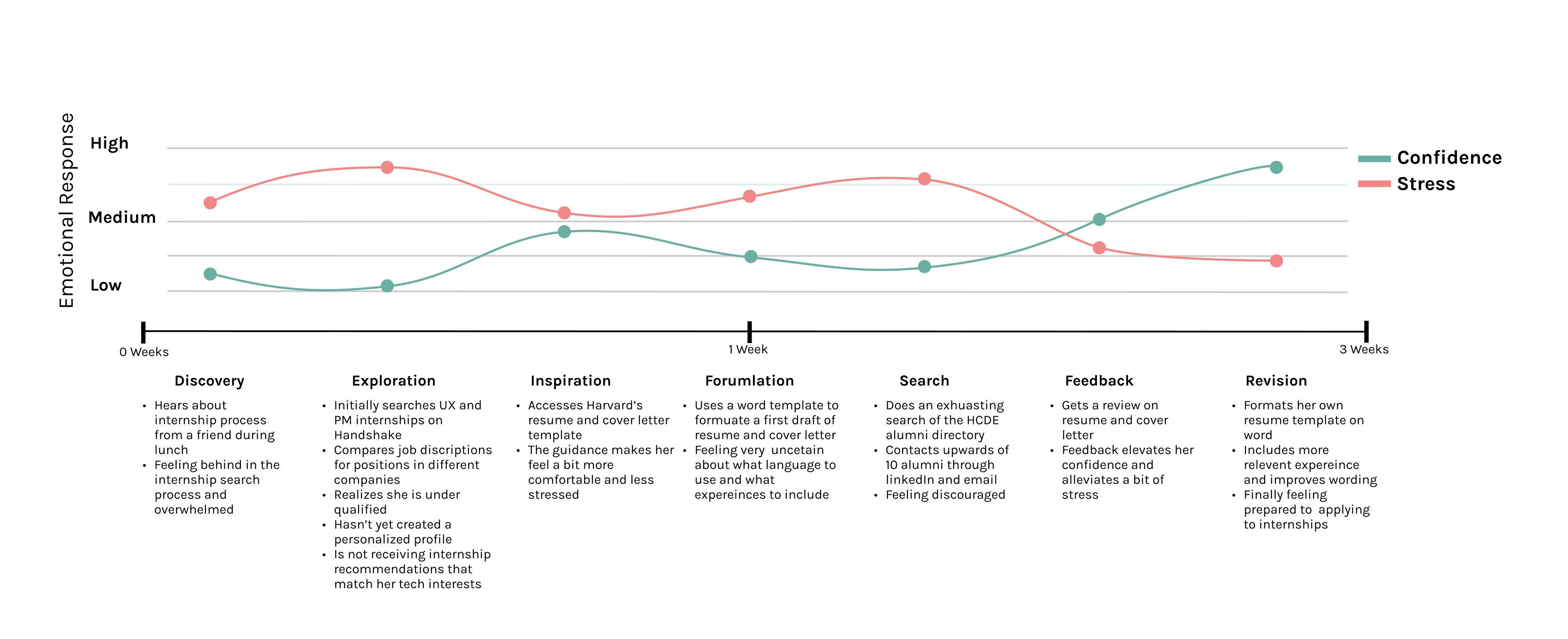
Lastly, we drafted a User Journey Map based on our persona, Sophia Johnson. Our journey map details Sophia's feelings of stress and confidence from learning about the internship process to revising her application materials. While the User Journey Map stages and descriptions are based on research, the emotional response levels were based on inference. This map helped us identify high points of stress to combat in our design.
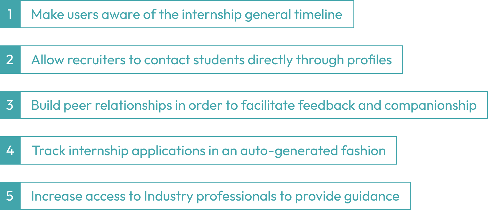
Based on our user research insights, we narrowed out the design requirements for our application. These design requirements allow us to determine the users’ needs, pain points, and goals which will become practical solutions in our application later on.
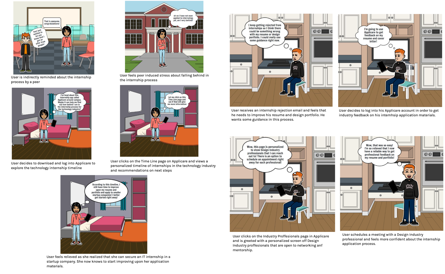
Our storyboards are created based on user research and design requirements. This step allows us to explore the possible solutions to solve pain points and demonstrate how users will interact with our application, which will affect our application greatly in the following design stage.
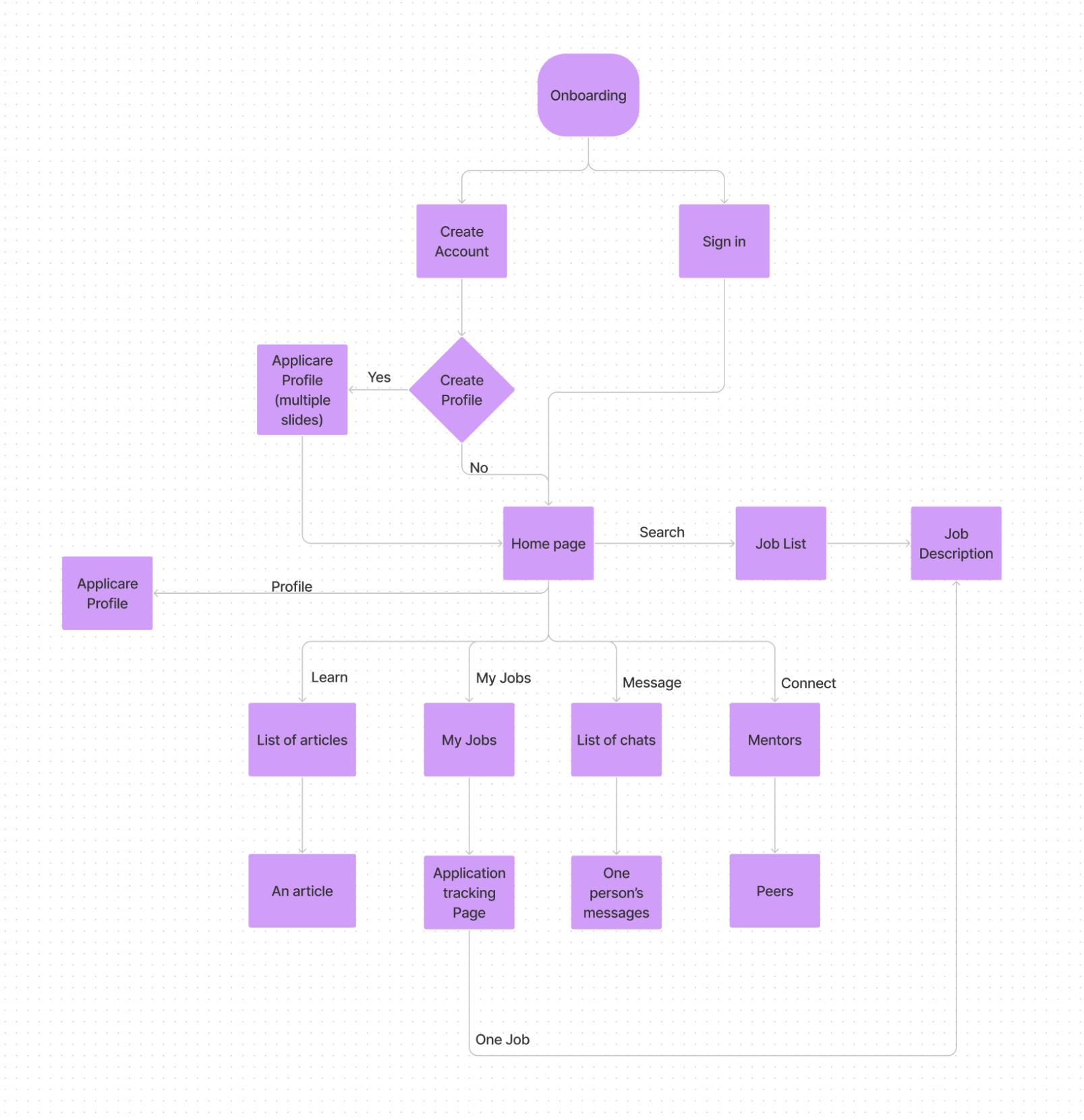
Having all the requirements and storyboards from the previous steps, we designed the information architecture for our application. Information architecture allows us to organize all the information we have got and combine them to reach the design requirements. This information architecture will be used as our foundation of low-fidelity wireframes for our application.

After completing our wireframes, we conducted user testings on students who are currently in the application search process.
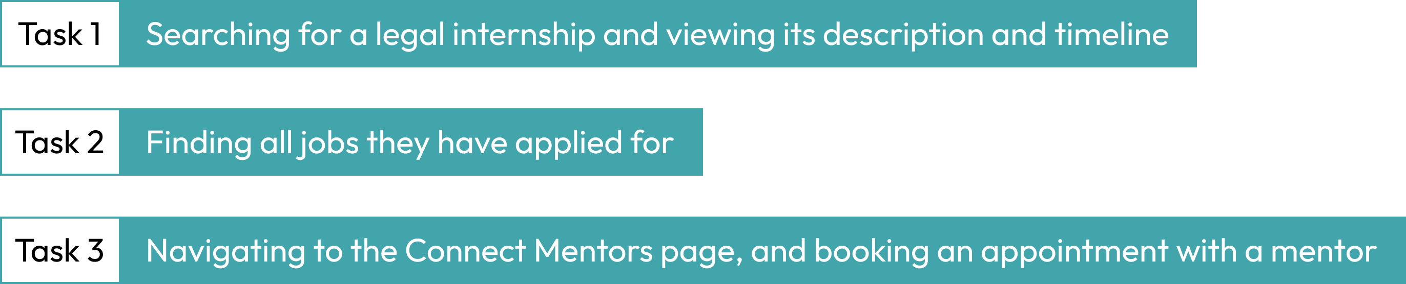
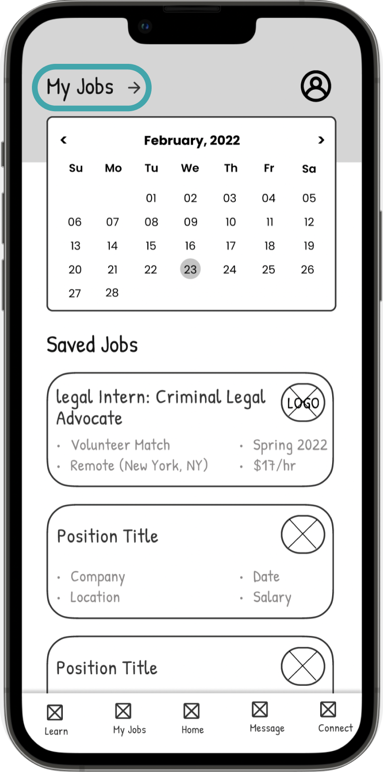
Users struggled to complete the second Task since the Forward arrow with My Jobs Description was unintuitive for Users
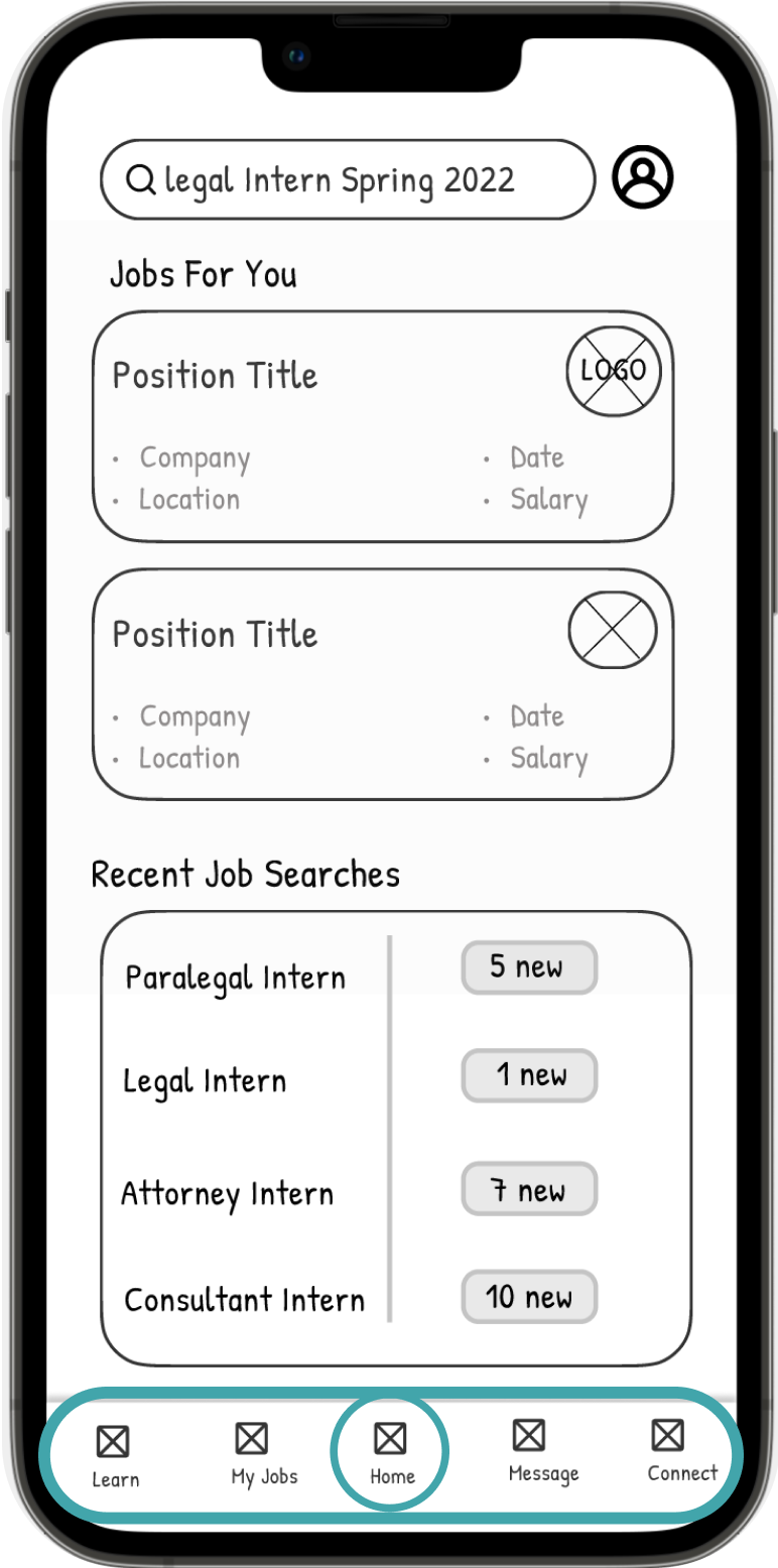
We noticed users repeatedly navigating to the home page instead of using the navigation bar when transitioning to different tasks
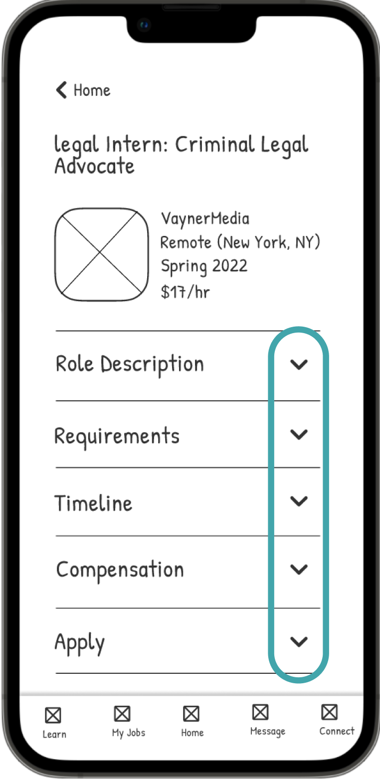
All users expressed their positive attitudes towards the collapsible Job Description
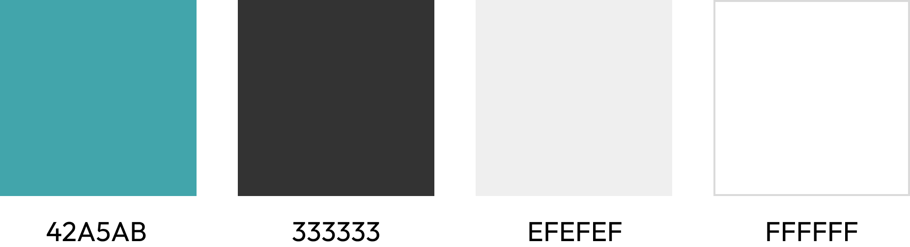
We constructed a color palette and type hierarchy for our high-fidelity prototypes. Through these choices, we intend to portray professionalism with a bit of playfulness and comfort.


Get in touch with me!